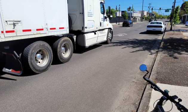
One of the “sharrows” in the right lane of Ellsworth Street in downtown Albany.
It was in 2018 that ODOT painted shared-lane markings in the middle of the right traffic lanes of the Ellsworth-Lyon couplet in downtown Albany. This is long enough for me to venture the conclusion that these so-called sharrows don’t actually work.
Those markings became a thing across the U.S. after San Francisco experimented with them in 2004, according the entry on sharrows (for “shared” and “arrows”) in Wikipedia.
The markings are supposed to indicate where bicyclists should ride. But if you’re on a bike on Ellsworth or Lyon, it feels dangerous to ride where the sharrows say you should.
Once you’re past a certain age, on a bicycle you’re not likely to be able to match the speed of motor traffic on those legs of Highway 20, even though the posted speed is only 25.
And who wants to be in front of a semi coming up from behind you, diesel roaring and tires pounding?
ODOT put the sharrows there because with parking on both sides of the street, there’s no room for bike lanes. But it’s a gesture without a point. Cyclists don’t dare to pedal down the middle of a busy traffic lane at 15 mph. And motorists don’t really expect cyclists to be there.
Wikipedia, sometimes belittled but still a good source for a quick reference, mentions several studies on the value of sharrows. Some studies showed the markings may reduce cycling against traffic or on sidewalks. But another one concluded that sharrows led to a slight increase in injuries.
ODOT probably is not going to blot out those markings on Ellsworth and Lyon, and it may even refresh the paint from time to time.
But don’t expect many bicyclists — certainly not this one — to take them seriously and tempt fate by riding in the middle of those lanes. (hh)

A semi approaches one of the sharrows on Ellsworth Street. (My bike and I are safely out of the way.)

Boy, I sure wouldn’t ride there! (Even on my ebike.)
Likewise, when 24th Avenue between Hill and Geary was newly paved last year, it got the same curious bike symbols all up and down it. How many people who need to know that bikes travel on the right side (but not where cars are parked) even understand what the signs are saying? I’d be curious how much was spent/wasted on these trivial and confusing signs. Psychologically, more signs is not better, but only tends to distract from existing signs or other traffic. In a word, overkill.
Your conclusions are legitimate. But let’s be painfully real.
Bicyclists are irrelevant to many motorists until the moment of impact. Painting chevrons over a bicyclist looks more like a hieroglyphic than a safety statement. They only distract and confuse many motorists.
Hey, government can’t muster the will to do road safety right, but at least they can claim they did something…anything. It’s only taxpayer money.
Fake “safety” that serves the common good….yeah, that’s the ticket, I think most of the sheeple will buy that line.
Another example of your local government at its finest.