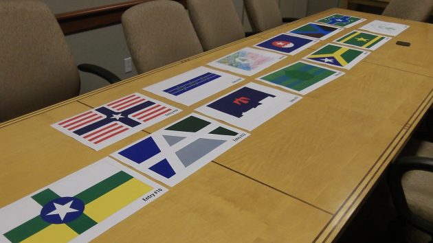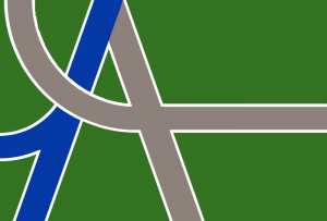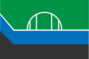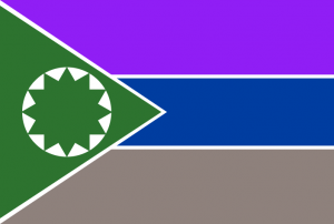
These were among the 18 semifinalists that did not make the cut to become one of five finalists.
Until a few weeks ago, nobody realized Albany needed a city flag. But then members of a flag cub at West Albany High School appeared before the city council, and now we have five finalists in the competition to choose a design.
The council called for a design contest, and 40 entries came in by the deadline on July 5. Since then, a jury narrowed the field to 18 and then to five. “They reviewed the designs with written descriptions provided by the designers, describing the symbolism in each one,” Marilyn Smith of City Hall told me. “They did not see the names of any of the designers.”
From July 22 through Aug. 8, the finalists will be on display at www.cityofalbany.net and at City Hall and the main branch of the public library, off 14th Avenue. Marilyn again: “We’ll ask people to rank them on a scale of 0-10 points. The rankings will be reported to the city council on August 10 and we’re asking for a council decision on August 24. The goal is to have a finished flag to fly during the Veterans Day parade.”
Unlike the high school flag club, which goes by “Greater Unified Albany Vexillological Association,” I’m no expert on flag design. But do the finalists all look a little on the bland side? Mostly muted colors — they all have kind of a somber look. Seems to me that if a city needs a flag, it would look for something that symbolizes optimism and pride, something that looks cheerful and bright.
The jury in this case was made up of Corey Barton, owner and graphic designer at NoDinx; Shannon Willard, who was county treasurer when Linn County got its own flag years ago; John Boock Jr., a patron of public art who commissioned and donated the reflective flag on the front wall of City Hall; Oscar Hult, a graphic designer and co-owner of the Natty Dresser downtown; Cole Pouliot, the West Albany math teacher who advises the flag club; and West student Nate Strader-Sprague.
Here are their final five


You’ll get your chance to rank them when the city officially posts these images and asks for your opinion. But remember, it’s the council that makes the final choice. (hh)


Frankly, I’m underwhelmed by the choices. Perhaps an explanation of the symbology would help. The gray/charcoal weakens four.
Too bad the 5th graders didn’t know about the “contest”.
Information was sent to all staff of the Greater Albany Public School District, in the letter it was suggested that they share it with their classes.
HO HUM – BORING Is Albany that boring to the artists?
I like the green/gray/blue (top right). Has an “A” and maybe some of Albany’s weird streets.
I really do like it; I would vote for it.
I see symbolism in the top-right flag (top flag in narrow browser windows) that its designer may not have intended. Two sides of the same coin:
1 – The transportation hub. It’s easier to go to most places from Albany than from, say, Corvallis or Lebanon; vastly easier if you’re not driving. Trains and buses on those blue and gray curves will take you there quickly.
2 – The railyards, highways, and sparsely-bridged rivers that make Albany less a city than a disconnected grab bag of neighborhoods. Dark green city pieces on a symbolic map, cut apart by blue rails and gray highways that feel as outsized in real life as represented on the map.
For Hasso’s “optimism … cheerful and bright,” add a bunch of rainbow-colored connectors over the dull lines that could translate someday into real bridges and paths over the all-too-real web of obstacles.
Anyway, this flag is my favorite just from aesthetics, never mind the symbolism. It has an oddly familiar look, maybe just from staring at it too long.
I like the one with the A…
For the curious, I believe most of the proposed designs are intended to conform to the principles from the North American Vexillographic Association.
https://portlandflag.org/good-flag-bad-flag/
I’m impressed by anyone who follows vexillology.
Had to look that one up…
Lemme see. Has to have a “screw” emblem on it. A” faucet with a $ sign” coming out. A “roundee-round” sign. A “pot-hole” with a tire mark across it. And maybe a “?” mark. All done up in Smurf colors so we feel good about it! To show it off have battlements build atop City Hall with flag poles. JE
OR… just a picture of you Jim.
Maybe with a nice cardigan sweater on. In July. With a tin-foil hat…
I did not design the flag with the bridge but I found this on it’s symbology;
“This flag has a Northwest Color Scheme of Green, Blue and Black
Green symbolizes Albany’s place as the Grass Seed Capital and its emerging Filbert Tree Market.
Blue Symbolizes the importance of the Willamette River and Calapoolia River in their roll in establishing Albany and Kalapuya Tribe
Black Represents Metal because Albany is the “rare metals capital of the world”
The White Bridge give this flag a landmark and ties in with other symbols currently in use throughout Albany
The Angle at the front of the flag symbolizes Albany location within the Valley and looks like the slope of a roof, of one of Albany’s many historic homes.”