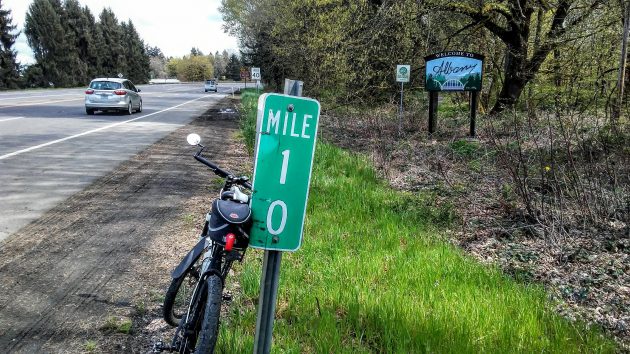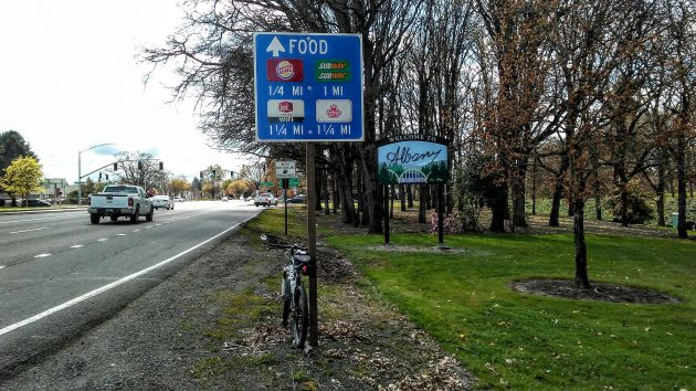
Here’s one of the two new welcome signs installed Monday. This one is on Highway 20 in North Albany.
It was three years ago that a reader of this website suggested Albany replace the dilapidated wooden welcome sign on Highway 20. That sign was taken down in 2019, and now a new one of metal has taken its place.
The Highway 20 sign in North Albany was to be installed on Monday, along with another one like it at the northern entrance to town off Interstate 5. And when I steered the bike that way on Monday afternoon, both installations had indeed taken place. Although the one off the freeway is a little harder to find.
The old sign on 20 was dedicated one rainy day in the 1980s, if memory serves. I remember standing in the soggy verge that day along with City Manager Steve Bryant and a bunch of others to witness the occasion.
Last week Marilyn Smith, the public information officer at City Hall, told me and the Democrat-Herald about the new signs in an email. Helpfully, she summarized the details, including these:
“Xtreme Grafx created the signs. Dahled Up Construction is installing them, with Foress Sign Company running the crane. Total cost: $7,300.”
Note the unusual lettering in “Albany.” That, Marilyn explained, comes from “the handwriting of Archibald (Archie) D. Monteith, brother of founders Walter and Thomas, who acted as a/the notary for Linn County as well as witness on the land deed for Thomas and Christine Monteith from Christmas Day 1866, which was only a year after Archie, a former captain in the Union Army, Co. F, 28th Regiment, Wisconsin Infantry, was mustered out of the Civil War. He died a little over five years later on February 28, 1871, and is buried at Riverside Cemetery.”
The idea for using the antique lettering was that of Matt Harrington, the city’s media and applications developer. He collected the letters from that 1866 deed and used them in his design of the signs. (hh)

The North Albany sign is easy to see from the highway.

At the northern entrance on Pacific, “welcome” stands out less because of other signs.


The only things missing are all of the backed up cars across the bridge, and the homeless living beneath it. Seriously…they look good!
Very attractive signs. I really like using the handwriting of Archibald Monteith to write the word Albany. :-)
I like the Albany font both because it looks distinct and is connected to local history. Hasso, thanks for noting the local companies that helped make and install the sign.
Very attractive. Thank you for all the background information, I enjoy the history of Albany.
Are the new signs set back more from the streets than the others we see because there are plans to widen the pavements?
Hasso, thank you for sharing this interesting information! I think the new signs are beautiful