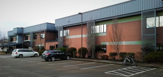
The main branch of the Albany Public Library on Monday. This is the north side, where the paint has faded little.
Ten years after the building opened, the paint colors on the Albany Public Library are no longer an issue. Partly that’s because people have more important things to think about. But mainly it’s because the color scheme looks OK.
The architects had recommended the brown and green to pay tribute to the valley’s farms and woods. But when the paint was fresh in late 2008, the donor who put up $5 million to convert the former insurance headquarters off 14th Avenue into a great main library was more than a little miffed. And in an editorial in the Democrat-Herald that November, I sniffed that the paint colors were “depressing.”
Now, 10 years on, everybody and everything including the paint have mellowed. I look at the building now and if I notice the paint scheme at all, I think it looks just right.
All this comes up now because some of the exterior paint needs refreshing, especially on the south side where sun, wind and weather do their worst. I first learned about this from the Nov. 27 minutes of the library board. One of the board members said patrons had noticed that the paint was fading. The minutes have Library Director Ed Gallagher telling the board that new paint is scheduled for spring. “He explained the original color scheme and the corresponding negative comments. There is a possibility to change the colors.”
When I talked with Gallagher Monday, I got the impression he’s now leaning toward just refreshing the colors that are there, a job he estimates can be done for less than $30,000.
He also has another idea, which he also shared with the board in November. One windowless wall of the building on the east side would lend itself to a big mural, colorful and possibly bilingual — something that would celebrate what the library means in the culture of the town. He’s looking for help in getting that concept further along.
Sounds like an idea well worth pursuing.
Having moved from across the street, the main Albany library reopened in the remodeled building on March 2, 2009. Every time I go in there, it is busy. With everything it offers — media, computers, meeting rooms, educational and entertaining programs for young and old, a quiet place for students to do homework or research, and yes, tons and tons of books — the Albany library is a wonderful place.
And the outside paint? Who cares? (hh)
This story has been edited to correct the dollar amount that a donor gave to create this library.

The library’s south side. The paint may be faded, but no one complains about the colors any more.

Who would see the wall on the east side of the library? I think I went around the building that way once, and discovered it is barely passable.
I was stunned when I first laid eyes on the colors chosen for the library when it was new. I’m grateful those original paint colors have faded. I hope the building won’t be “refreshed” to the original unpleasing if not jarring colors, because the library has a more calming affect as it is now. But even though I question the sensibility of the choice of the original colors, I would continue to patronize the library if it was painted hot pink and chartreuse.
I think the color scheme is just fine.
And what was the purpose of bringing up the past in the discussion?
In tax year 2018-2019 CARA will skim $1,181,603.70 from the city’s general fund.
http://www.co.linn.or.us/assessorshomep/docs/2018/SAL4E.pdf
I wonder if some of that money could have been budgeted, instead, for new paint?
Asking for a friend.
I think it looks just fine. It has always looked fine. As Hasso says, a library is about what is inside, not out. I personally have not been there, but I might try it now that it is in the news. Cheers to the City of Albany for choosing a nice big building where people can do what libraries are meant to provide. It is a great asset to the community!
I know a little about color. That shade of green is known as a “cold” color. Think rain or moss on the roof. Not inviting. Spring color greens are lighter in shade. In any event, “Library Green” should be used sparingly, and definitely not as the only color in an entryway.
Peggy’s color scheme of hot pink and chartreuse would be an improvement…….
The complaints back in 2009 (or whenever) started before the painting was finished. There was an additional shade of green (actually a chartreuse) that was on the building in small stripes for a bit. It was subsequently covered by brown. The elimination of that color made it all look fine.
The Library’s fading color serves to remind us of the impermanence of all things.
The wheel turns, the rain falls, the sun beats down. The cycle continues.
“cold” or not, I think “Library Green” does look very fine indeed!
Any color scheme means different things to different people; love it, hate it, it is what it is. And here’s an Albany fun fact: The library director was once upon a time a part-time Democrat-Herald sportswriter.
Just repaint it in its current colors and move on. We don’t need to waste time and energy debating what colors look better or best. There are more important community issues.
The exterior color is irrelevant. On a scale of ten, it’s about 0.01 compared to the collection and its accessibility
I love the idea of a mural. Artists probably would not charge much more than commercial painters, and a good design would be a great community point of pride.